Change Up Your Artwork For A Quick Home Refresh - With Desenio
If you’ve been following the blog for a while, you’ll have seen that I love changing and rotating the artwork in my home regularly. I think it’s a great way to freshen things up now and then. Artwork in our house is anything! We have a combination of prints and works from galleries and artists that we’re slowly collecting and growing, but we also have some pieces created by the kids. I have a graphic design background, so also love experimenting with my own designs, and of course we also have a few prints from online stores. So when Desenio asked me to collaborate, I was excited to show how you can use just a few prints to get a really great effect at home.
To select my prints, I used Desenio’s ‘Create Your Gallery Wall’ tool on the website.
The gallery tool gives you a realistic background and many layout and size options to try out your selections. These are the two prints I chose for above my dining room console.
The tool is really easy to use and you can easily swap out your selections. It’s so helpful to show how your selected prints will work together if you aren’t very good at visualising!
I already had the Berlin Arches No2 in my living room, which appears in my previous blog post: Messy Toys? How To Make Toy Storage Look Good
I decided that the living room and dining room could do with a bit of an artwork change, and I love using abstract and graphic designs, so this strongly influenced my choices.
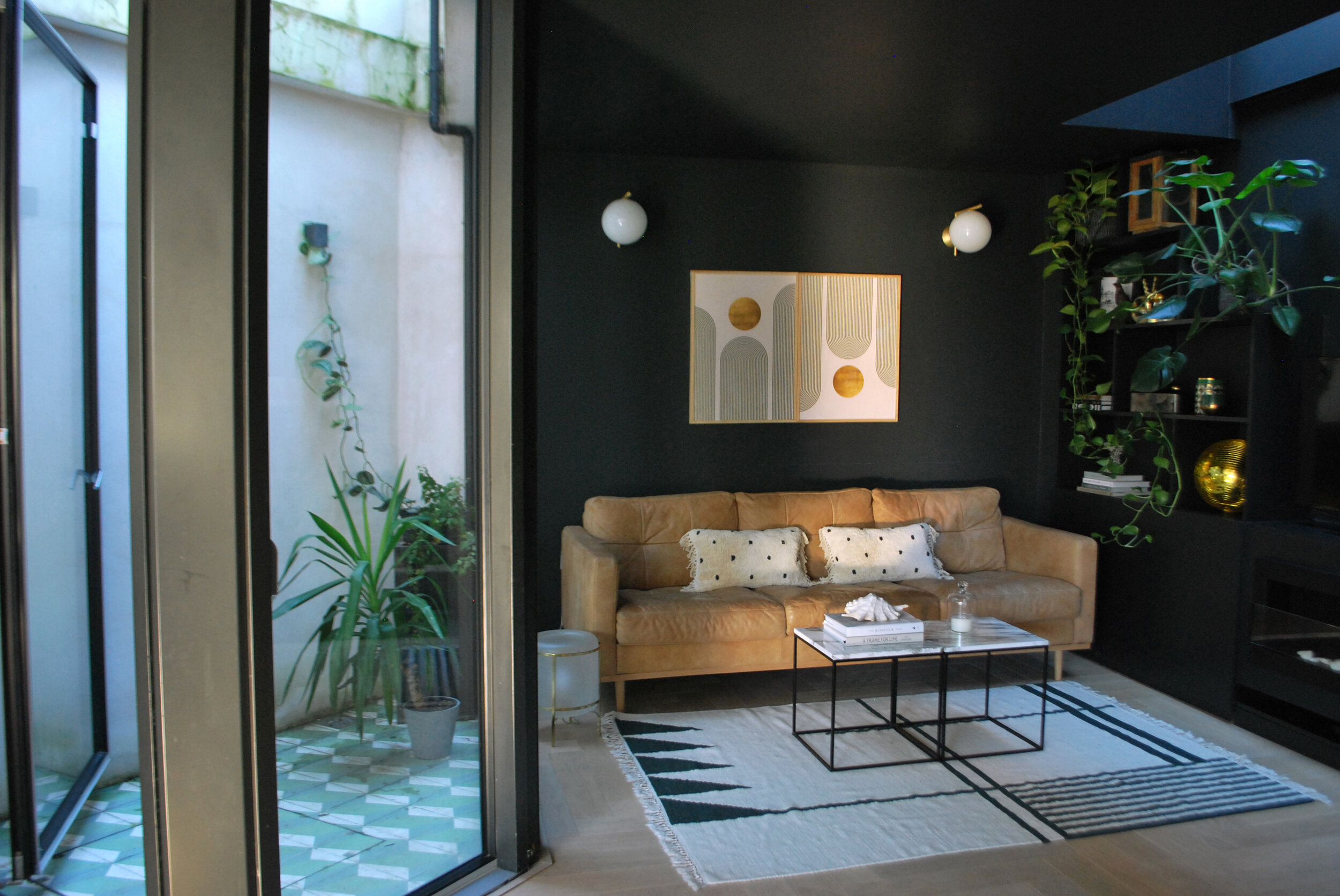
In the living room, I already had Desenio’s Berlin Arches No2 hanging above my rattan cabinet, so for the opposite wall, I decided on the Green & Gold No2 Poster, it has a very similar design with the circles and arches and I love the repetition as the eye moves around the room. By hanging one upside down, and having the frames touching, I’ve created a feature using just two prints. I chose the beautiful oak frames because the colour worked so well with the tan leather sofa.
By chosing two of the same print and hanging one upside down, you can create a unique feature. This is the Green & Gold No2 Poster
I chose this design because the circles echo the wall lights and the gold and oak frames work really well with the colour of the tan leather sofa.
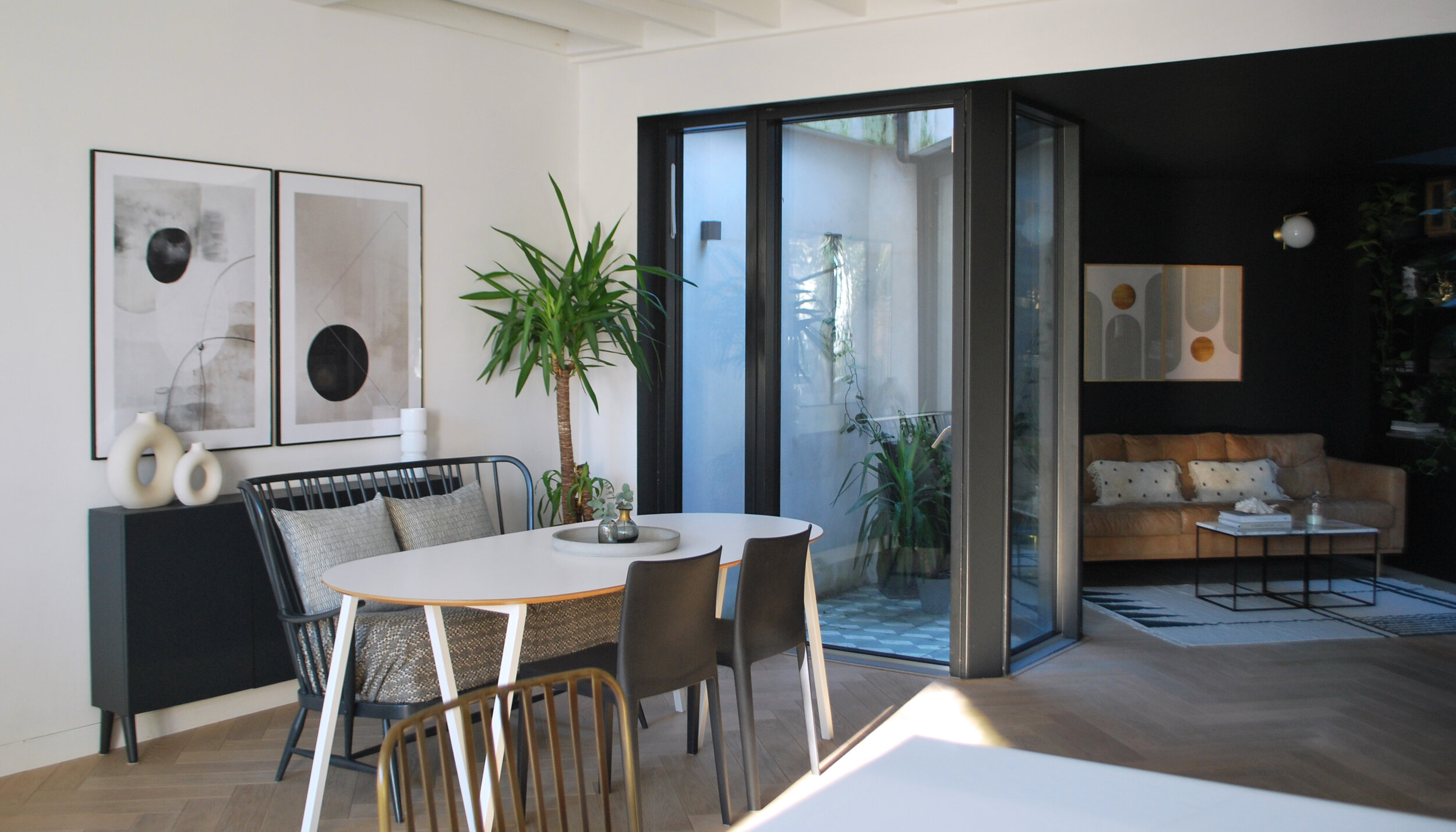
For above the console in the dining area, I selected the Painted Shapes No2 and Berlin Squares No2, deciding to carry through the repetition of the circle shape from the living room. I love these monochromatic abstract designs in the black frames, they compliment the black console and other elements in this area.
Even though one print has clean lines, and the other is more freely drawn, I think these two designs work really well when placed together.
Painted Shapes No2 and Berlin Squares No2 (100x70cm)
In the photo above, you can see that the circles carry through all four prints. If you find choosing artwork difficult, a great tip is to find a common element in the room and replicate it in the artwork for eye-pleasing repetition or symmetry – like I’ve done here using the circular shapes of the wall lights and the print I already had.
If you’d like to freshen up a room, hanging some art is a quick and easy way to do this, check out Desenio’s huge range that is also affordable, and will suit many different interior styles.
This blog post contains prints gifted by Desinio as part of our collaboration.


