HOME TOUR: Project Reveal, A Light & Bright Family Home
I have to say, when these particular clients asked for our help, I was surprised. Esther is an architect, and Robin is an animation developer, so I thought they’d relish in the process of a home renovation. And so they did, but it wasn’t so much a matter of having the skills and the creative eye, it was more a case time shortages and needing help with overall materials and colour selection.
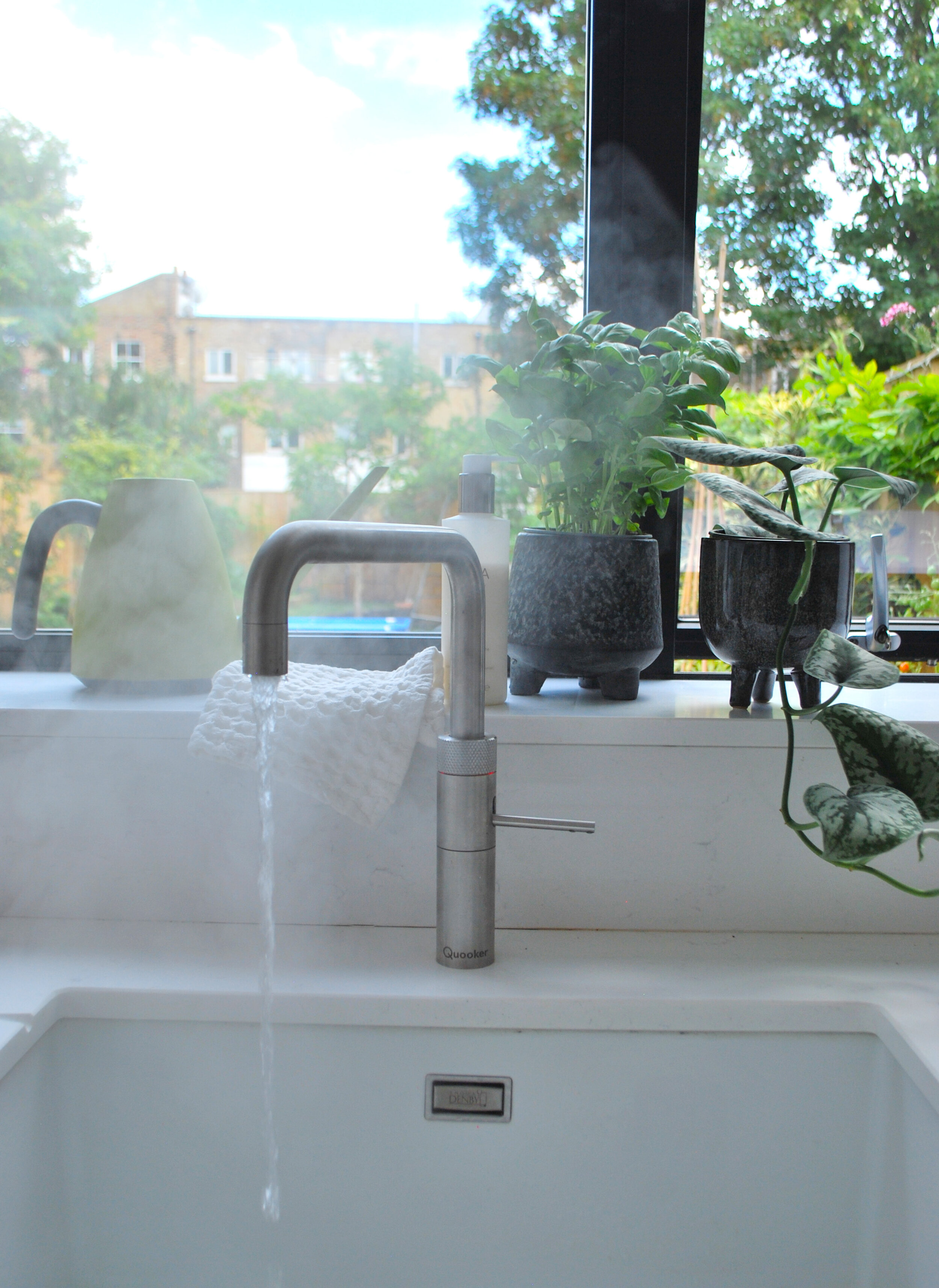
The new kitchen/diner is light and bright, and perfect for entertaining.
The clients started off with quite a spacious semi-detached Victorian property in North London, but the issues were that the house lacked direct access to the garden from the kitchen/diner, and also had quite a narrow hallway. The flow of the ground floor was disjointed for entertaining and also had no downstairs guest loo. They also wanted a home office and an extra bedroom for regular overnight guests, as their families visited often and stayed overnight.
The solution they came to with the help of architect Liz King, was to add a full with rear extension, to add space for their desired kitchen/diner linking to the garden, as well as a loft conversion, to become their bedroom suite and home office.
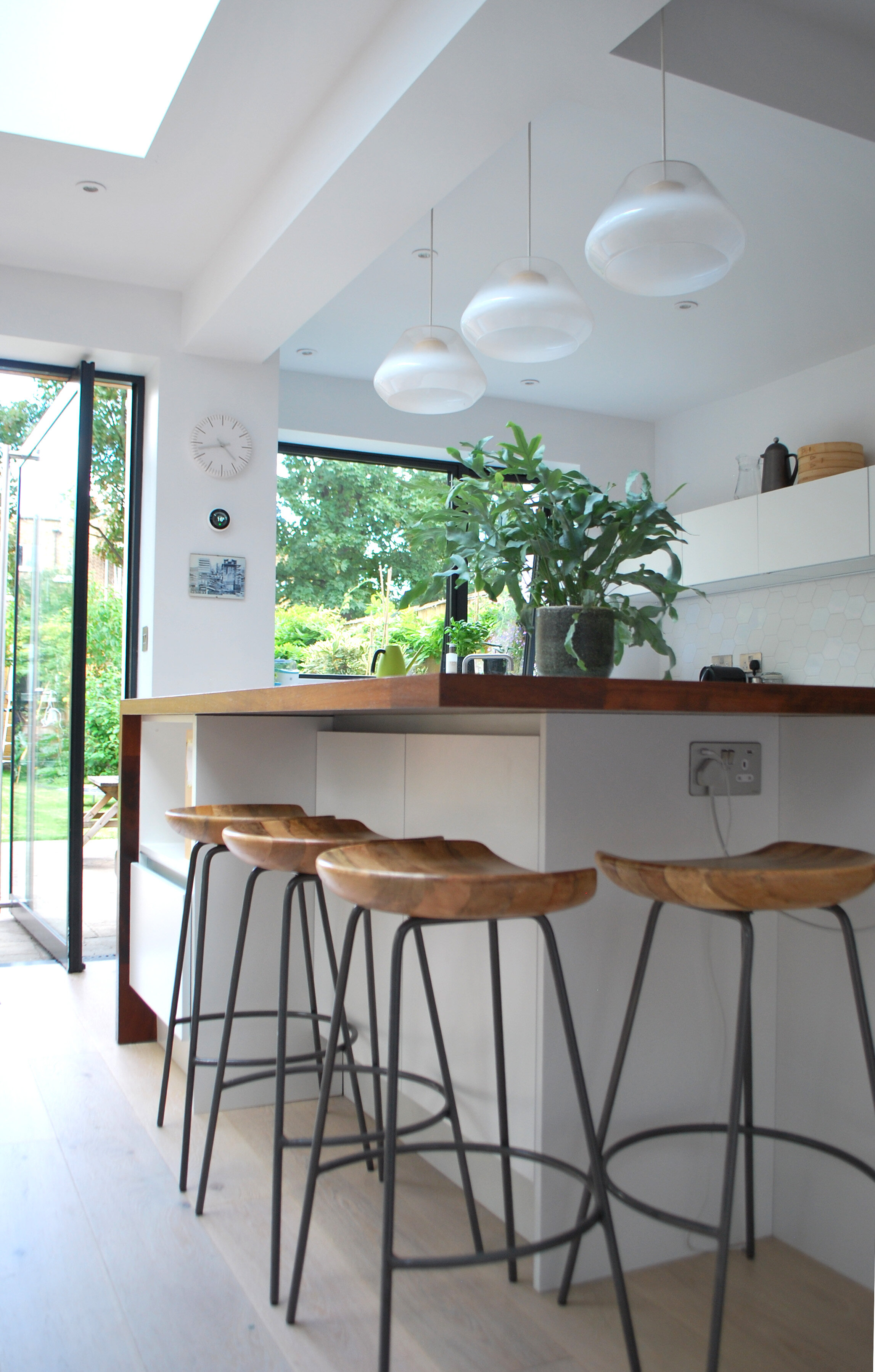
We love the unusual band of Iroko wood wrapping around the kitchen island.
At the consultation, I sat down with Esther and Robin to discuss every aspect of how they use their home, and what they did and didn’t like about it. I usually ask questions like where do you like to sit and eat as a family? How many people do you usually invite over for dinner? Where do you dry your clothes? And many more! I really try and dig down into the aspects that will improve the way people live in and use their homes. These give me a really good idea for planning the flow and the floor plans.
The splash back tiles were a great find! They are crisp in white, but with an unusual shape and variation.
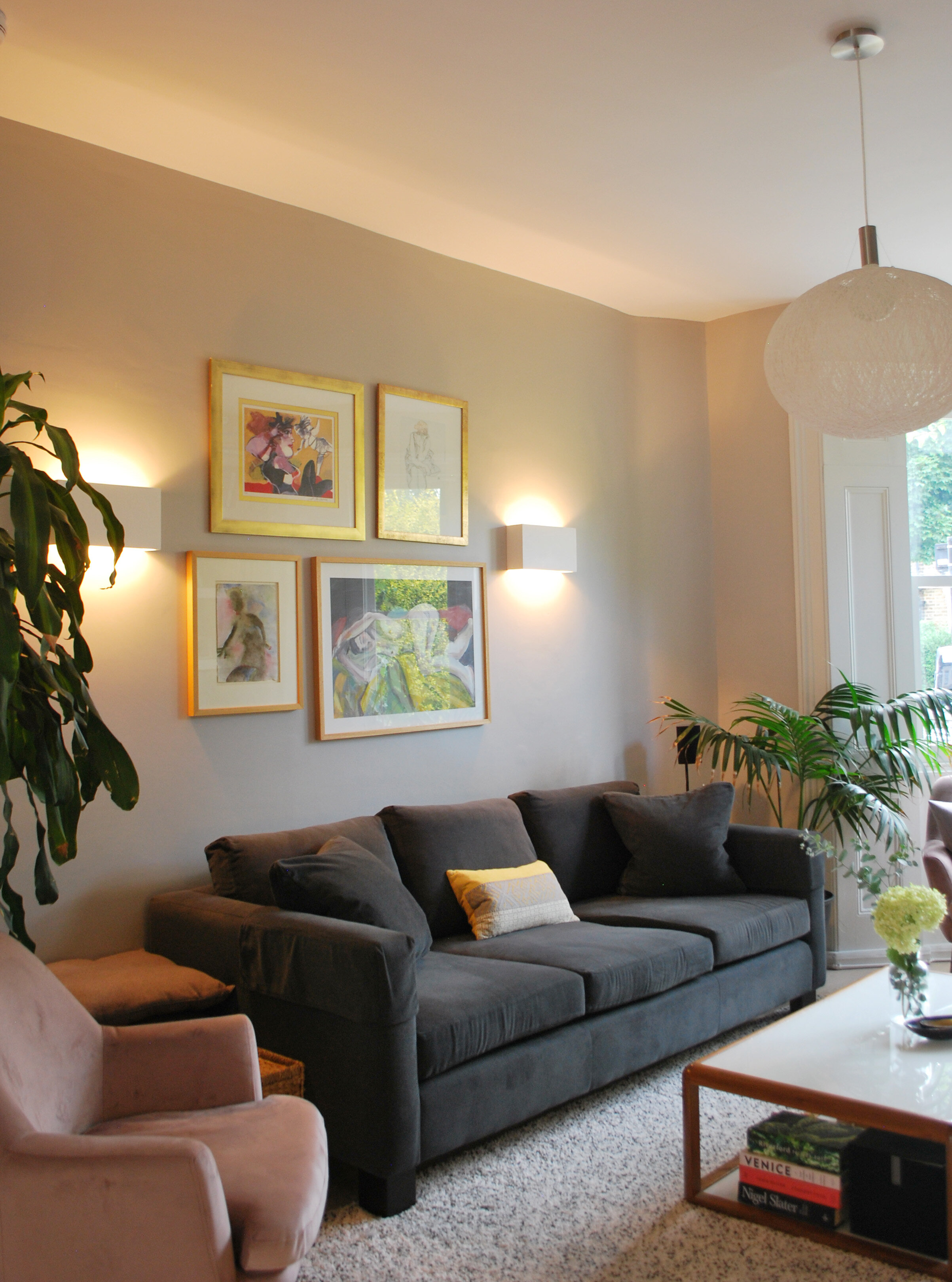
For the living room colours, Esther used a really clever trick, using one of the cushions I’d presented in the mood board, that they both really liked the look of, she picked out various colours to create her own colour palette, and using this, they selected all of their living room colours and furniture, resulting in a calm, cosy and cohesive scheme.
The cushion on the left that Ester used as the basis for her coloiur palette on the right.
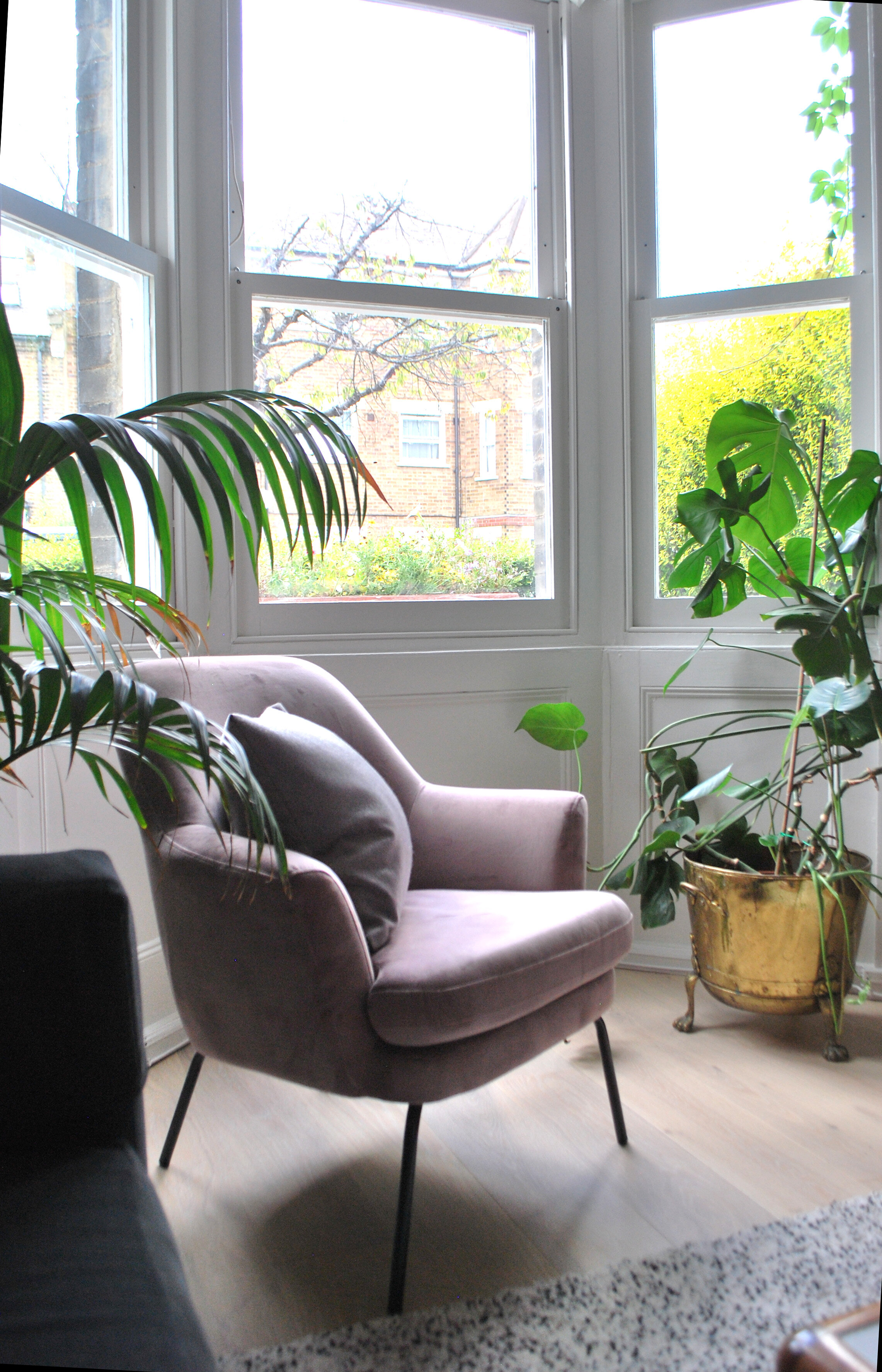
The calm and cosy living room in the colours Esther picked from her clever colour palette.
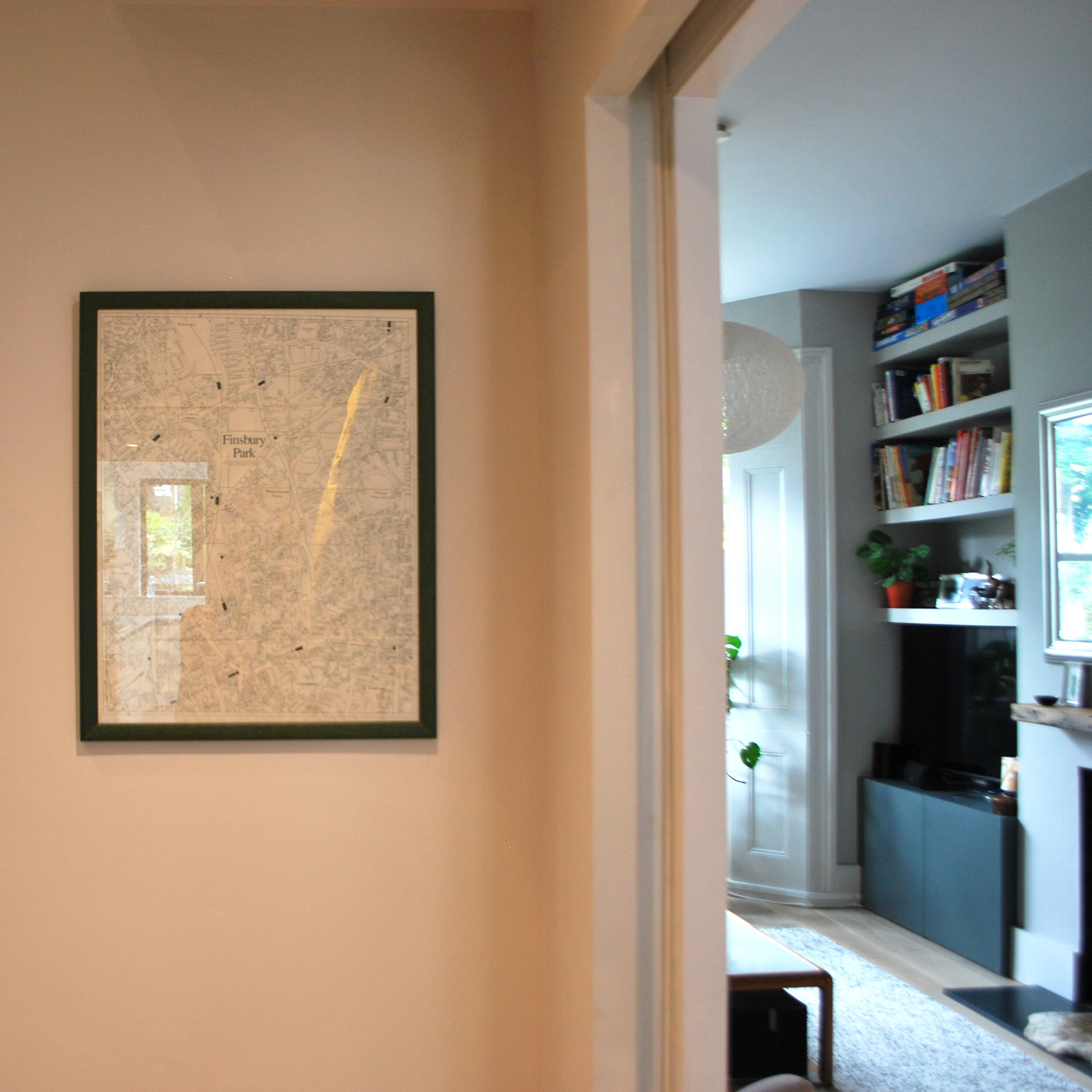
The space between the living room and new extension, that usually ends up as an awkward, dark space, is much used here as a play room, craft area and spill over workspace.
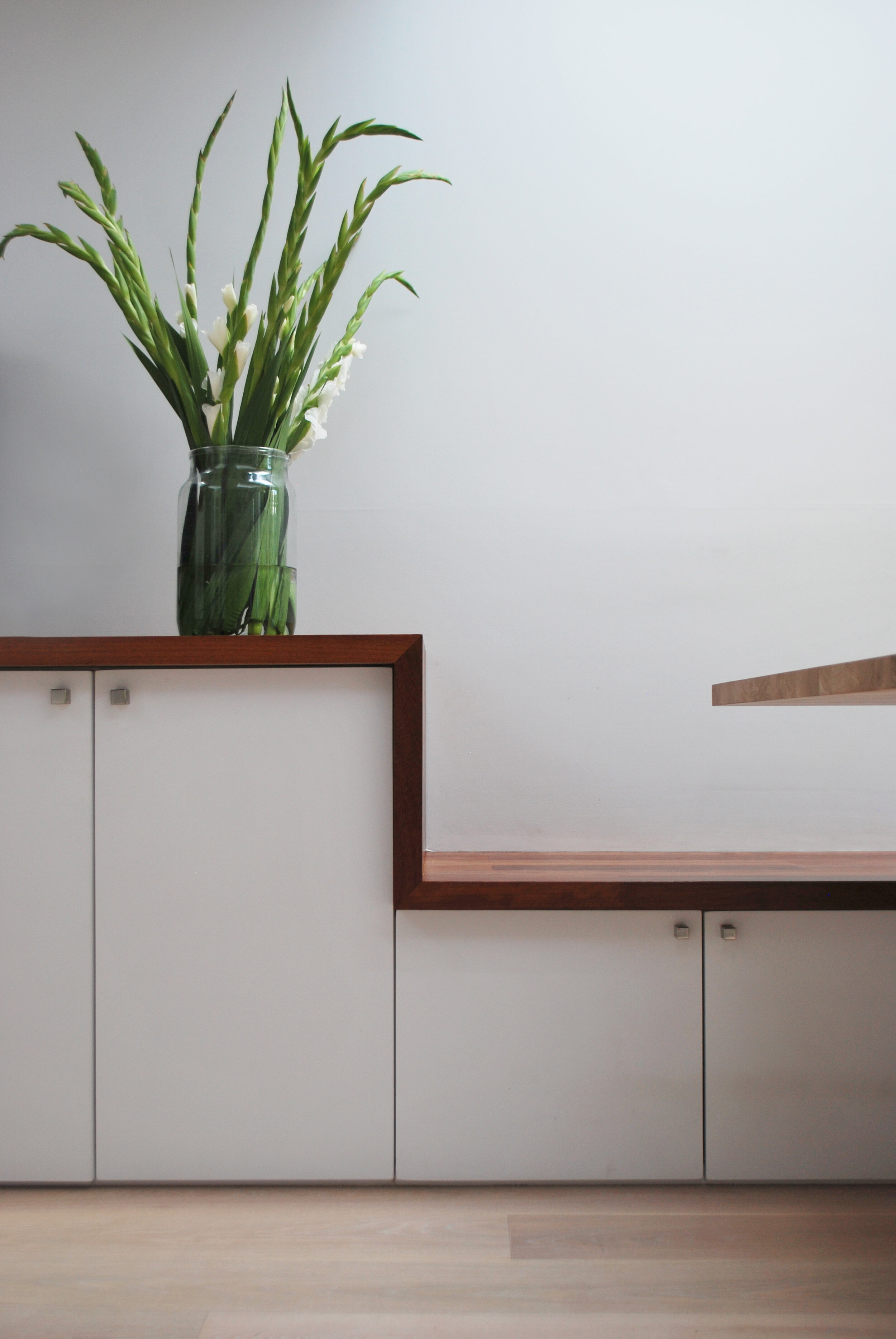
For the new extension, we decided that the space would be kept light and bright, with pale flooring and a white kitchen, we discovered at the consultation that both Esther and Robin really liked yellow, so we decided to being this in in the way of the large glass lights above the dining table, as well as in the mix of chairs. I love the way they decided to use the Iroko wood, the bar wraps gorgeously around the kitchen island, zig zags the shelf and seating behing the dining table, and even appears on the exterior of the extension.
The burst of yellow is happy and welcoming.
The Iroko from the island is carried through to the exterior cladding.
The iroko bench pleasingly snakes around the dining table (above, and kitchen island (below).
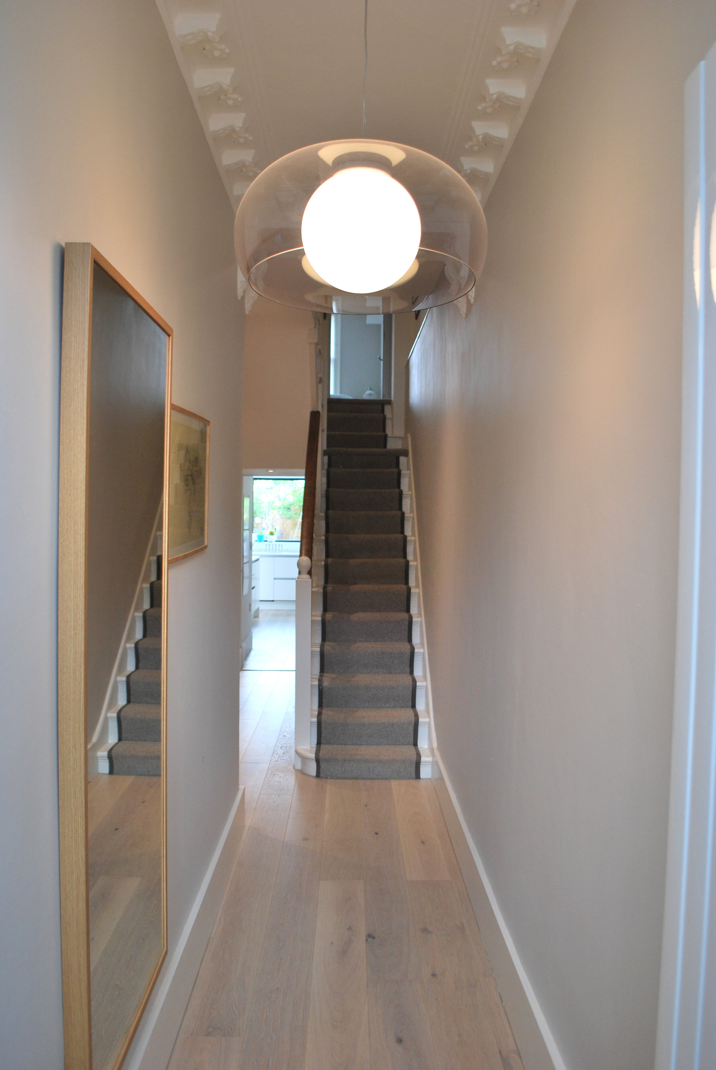
As the entire ground floor was being renovated, Esther and Robin took the opportunity to redo the hallway too, a new colour, flooring, stair runner and lighting all add to the feeling of spaciousness in the new hallway.
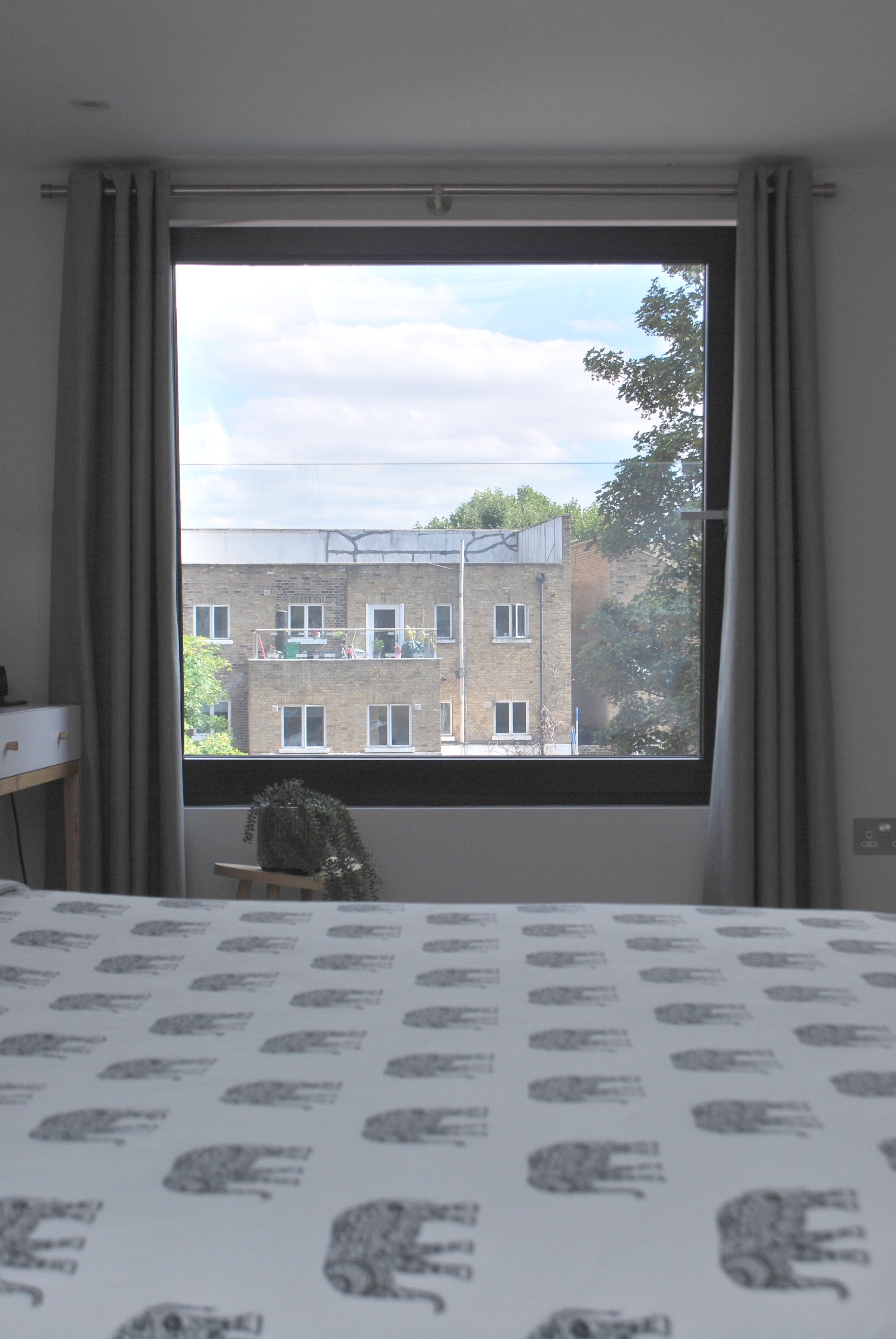
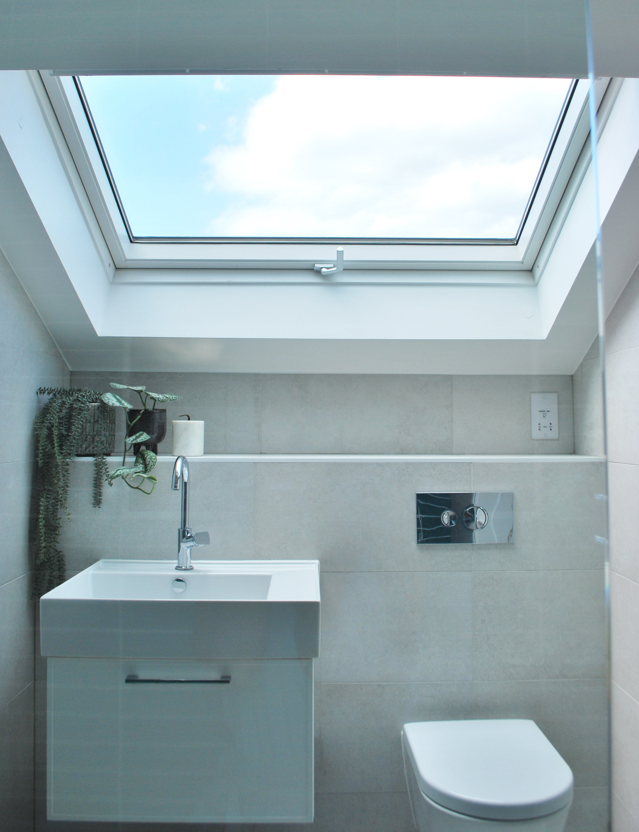
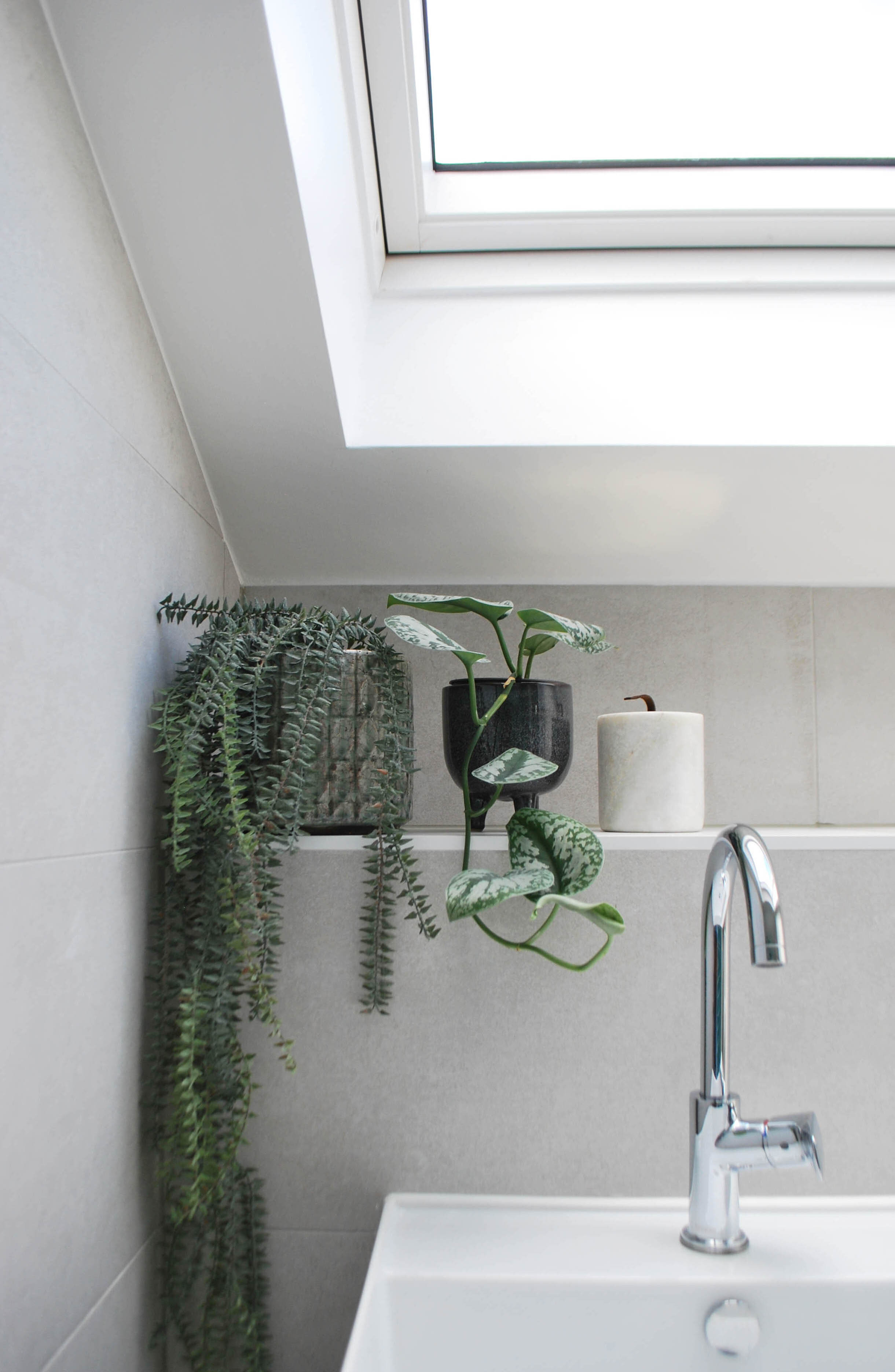
Upstairs in the loft, they have a brand new floor to their home. The large picture window and skylight, make for a beautiful main bedroom, and the larger than expected en-suite shower room is calm and relaxing with it’s muted tones, and plenty of light thanks to the large skylight.
The completed exterior shows the new loft and rear extensions.
The Clients Say:
We contacted South Place Studio to help us with the complete refurbishment of our North London home. A number of conversation early in the project helped guide our choices for layout, colour and materials throughout the house. The advice we received was invaluable, expertly tailored to our particular tastes and lifestyle, and most importantly provided a clear vision for each room and a roadmap of how to achieve it. We find delight in the result every day - I couldn't recommend the service highly enough!
WATCH THE PROJECT VIDEO HERE:
Credits:
Architect: Liz King
Construction: Forest Lofts, Mick, 020 8711 1483
Interior & Renovation consultation, styling and photography: South Place Studio


